Sadly, there is a lot of confusing and complete nonsense advice on the web when it comes to the world of Mobile SEO.
You may of seen this Matt Cutt’s video, or this infamous post on the Google Webmaster Central blog. Ignore them both for a minute. I’m here to muck up the rubbish, and set the record straight for so-called Mobile SEO.
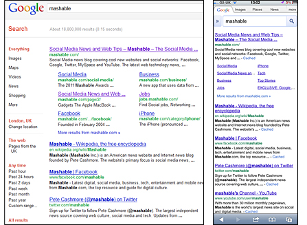
Firstly, the unknown truth is that the term is arguably pointless, as Google search results on a smartphone are the EXACT same as the Desktop version of Google.
Only the site-links slightly vary based on screen-size.
So, why are they the same? Think about it.
“For now, we expect smartphones to handle desktop experience content so there is no real need for mobile-specific effort from webmasters.”
- @PierreFarr (Google Webmaster Team, I’ve met him, nice guy!)
April 2012 Update: The rules have changed slightly! If Google identifies the mobile version of your page, it will swap out the standard search result with a link directly to URL of the mobile version. This is Google making up for developers sloppily making mobile sites! So read on..
A Brief History of Mobile SEO
Mobile SEO as a term originally meant ‘Best SEO Practices for WAP/iMode compatible websites’ aka mobile internet on pre-smartphone handsets.
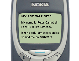
For me, I’m talking about my old Nokia 3310 that had Snake II built-in (what a game) and a browser that proudly displayed my first ever (aka awful) WAP website. I was 13.
In a response to a growing Mobile Web, Google developed a seperate search crawler (Googlebot-Mobile), advocated XHTML Basic markup and launched google.com/m indexed with mobile-friendly search results perfect for my wicked Nokia. Any of these standards sound un-nervingly familiar?
These aren’t the Droids your looking for
If you have ANY questions about working with Googlebot-Mobile, Mobile Sitemaps or XHTML Basic – STOP! LOOK & LISTEN! – all of these standards were created to support websites designed for older handsets NOT smartphone compatible sites.
Of course, not everyone has a smartphone, but near-enough all mobile browsing is made with one. So ignore those OLD standards and get with the times grandma.
Mobile SEO is actually ‘Mobile-friendly SEO’
The truth is, SEO for smartphones and ‘regular’ SEO are near enough the same bloody thing, so breathe a little. It’s the same set of search results, so for the most part, you can play by the same rules.
How to choose the right URL for your Mobile Website
The biggest Mobile SEO concern is the URL structure that is used for the smartphone version of a website.
Usually, mobile websites have either of these URL Structures:
- The exact same URLs as the full website
- Host the Mobile site on a sub-domain/folder e.g. http://m.domain.com/ or http://domain.com/m/
But, which is best for Mobile SEO? Every single time, hands down, the answer is use ONE URL (to rule them all). Don’t believe me? Let’s fight it out.
Why Mobile Sites should NOT be on Sub-Domains/Folders

#SEOFacepalm
Most one URL solutions are achieved by serving a seperate CSS stylesheet built for smartphone users, but the page itself will still have the same HTML code. Yuck?
This works great for smaller, static websites, but is a bloated solution for larger, more complex sites. Take a Shopping website for example, the ‘shelf space’ to advertise products on a smartphone is much less – hence the need to create an entirely new HTML/CSS layout.
Using CSS only to achieve this is sloppy, resulting in high load times due to lots of hidden, un-used code (display: none; isn’t always your friend).
As a result, the easy way out can be building two seperate sites, with yep, different URLs. Doing this can cause massive SEO problems and naive user experience mistakes.
Mistake 1) Split Link Equity & Social Shares
If a mobile visitor shares a page across Twitter, Facebook or their Tumblr/Wordpress App, they’ll unknowingly be posting a link to the mobile-version of the page.
Not only will this piss off a desktop-user, who upon clicking is forced to see a mobile-formatted page – it also will result in split link equity – where you have two different groups of links pointing to two different urls, both of which have the exact same content. #SEOFacepalm.
Mistake 2) Duplicate Content
Oh dear. Split links, different URLs & same content = duplicate content. Not good at all. Besides the mythical ‘trust’ ranking factor, all these elements will result in a page having a weaker keyword ranking, or the wrong version of a page indexed, or neither at all.
Having one canonical URL for a website page, regardless of how it looks, is better your visitors and your rankings.
How to keep ONE URL for both your Full & Mobile Website
Solution 1) CSS3 Media Queries
Of course, if you’ve got a simple, basic website – using a seperate CSS stylesheet with CSS3 Media Queries is likely the way to go. Smashing Magazine has a great tutorial on this.
Solution 2) WURFL Device Detection <– THIS ONE!
 But, this is better. WURFL is an jaw-dropping set of open-source API’s that can be used to detect a visitors device (desktop, smartphone) and then serve the relevant template for that user e.g. load the smartphone theme for iPhone users.
As all of this is figured out server-side, it won’t affect the page URL, meaning yes, ONE URL for both your mobile & desktop sites – GENIUS!
WURFL has API’s for PHP, .NET & Java, check them out, and to get started, check out this superb tutorial from the Nokia community.
Bonus Solution No. 3) WPTouch for WordPress
Got a WordPress Blog? Install the WP-Touch plugin immediately. It’s a great out-the-box solution, works like WURFL and is completely free.
If you HAVE to keep both Mobile & Full Sites on Seperate URLs
Already got a mobile site? To late to switch camps? I begrudingly hear you. Go implement these ‘band-aid-fix’ Mobile SEO guidelines.
Quick Fix 1) Handling Duplicate Content on a Mobile Website
Use the rel=canoncial tag (more info) in the <head> section of a mobile webpage where you’ve got the same content both on the Mobile & Desktop site.
Use the URL of the desktop version. This will tell the Search Engine the canonical page it should index and rank.
<link rel=”canonical” href=”http://www.domain.com/full-site-version.php“/>
Quick Fix 2) 301 Redirects for Mobile & Desktop Users
Implement 301 Redirects so that if a Desktop user or Googlebot lands on a smartphone-formatted page, they are sent to the desktop version. You should also do the same for mobile visitors who visit a desktop page.
For Apache servers, this is a job for .htaccess. If you can’t do this, at least ensure there is a link on the page to switch between each version.
Quick Fix 3) Social Media Sharing
If you offer the option to socially share e.g. Tweet, Facebook Like a page on your Smartphone website, make sure it’s actually sharing the URL to the desktop version of the page.
This will stop the desktop version of page, the one in the search results, missing out on any potential link juice!
Summary
Ultimately, Search Engines only want to have one version of the web to deal with, and so do your visitors. If you have any feedback on the above, please leave a comment!
Thanks to @bennoislost, @lucirebecca & @joewilcox for all the help on this post. Make sure you also read this blog post on the Google Webmaster Central Blog by @pierrefar.


